Top 4 Website Design Trends to Boost Your Website Traffic

Everyone wants to make a good and lasting first impression. Your website, in most cases, is your company’s first impression on potential clients. If your website is poorly designed or loads slowly, you could lose the interest of your viewers.
A well-designed website is going to keep a customer on the page, while a poorly designed site will lead to high bounce rates. In this blog, you will learn about some of the latest design trends in website design that you could then potentially include in your website redesign to help boost traffic.
White Space
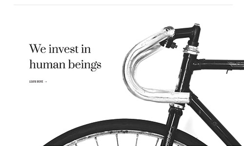
White space on a website can be done in many different ways. It helps to give the eyes “room to breathe” if you will and helps to make a page look less cluttered. While it is good to have this white space, you also don’t want to overuse it with too much open and unused space.
An area many companies use white space in on their site is at the top of the homepage, the first thing a client will see. This gives off a clean look and makes the company look professional.
Minimalist Design
Minimalist design goes hand-in-hand with white space. Typically, minimalistic design is just that – minimal design elements on the page to create a very simple and professional look. This design style tends to not be too flashy and displays the content of the page in a very professional manner.
Mix of Graphics and Photography
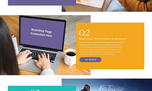
Another popular design trend is mixing graphic design with photography. This is typically done to bring the viewer’s attention to a particular spot on the page. It can be as simple as a different colored box being an offset frame around an image or text, or it can be as whimsical as a stroke of paint across the lower section of an image to bridge the gap between white space and the photo.
Overlapping Layers
This design trend is similar to the mixing of graphics and photos and can be used together in many cases. Overlapping layers is most commonly used with text over images. But it can also be used to draw attention to an area on the page or to give depth to elements that would otherwise look flat. Giving depth helps to break up the page and add dimension.
Many of the design trends we mentioned could potentially be used together. Having some overlapping imagery when people arrive at your homepage while also allowing for good white space around it. Perhaps you have an image with an offset block which would also include overlapping layers. The possibilities are endless!
Have a website built that gets the job done, but want more? Have you thought about hiring a company to do a redesign? Your website may be “getting the job done” but what if it could bring in more traffic and possibly more leads?
Contact the professionals at Salt Rank today to help you with your website redesign and get back in style with the latest design trends.


