What Makes A Great Landing Page?

A converting landing page is the cornerstone of any online business. No matter how good the content is and how well optimized the ads are, the bounce rate is bound to increase without a good landing page.
The layout needs to be flawless and easy to navigate. The landing page needs to grab the attention of visitors and convert them into leads.
So, let us discuss a few tips to make a great landing page.
8 Tips To Make A Great Landing Page
Tip #1: Clean and Organized Design
The main aim of a landing page is to increase the conversion rate, and to do that, it must be well organized. The overall design of the landing page has a massive impact on visitors. A cleanly designed landing page makes it easier for customers to navigate across the website. They should be able to go from one portion of the page to another in a hassle-free manner.
A good landing page needs to have eye-catching colors. For example, a contrast between the color of buttons and the background of a landing page provides an attractive look.
Short-form landing pages work best for minor purchases. A recent study shows that a gym chain could boost sales by a wide margin because they used a shorter landing page.
Tip #2: Implement Minimalism
Too many elements present on the landing page confuses visitors. Display only minimal information that is needed to increase the conversion rates.
It is good to use bullet points to arrange all the essential points in an orderly manner. Important headings can be highlighted. Visitors also prefer to see numbers. So, using numbers to mention relevant discounts and promotions will boost sales.
Only when the visitors are interested in knowing more about the product will they scroll down for it. So, make sure to display the extra information only in the lower portion of the landing page.
Only the critical points need to be placed in the upper part of the landing page – that will help to boost the landing page.
Tip #3: Use Trust Signals
An effective landing page makes use of trust signals. Trust signals will reassure visitors that the website is trustworthy and branded. Often, a trust signal is little more than some well-designed logo. Testimonials also act as trust signals. Some websites even display the “Like” button that shows the number of likes the brand has on social media platforms. Even trust badges such as “Fortune 500 Company”, “DELL certified,” and “Verisign secured” are useful and powerful tools that act as trust signals.
The purpose of trust signals is to assure a customer that they have made the right choice when buying the product. They can also help show that the retailer belongs to a particular trade union.

Tip #4: Mobile-optimized Landing Page
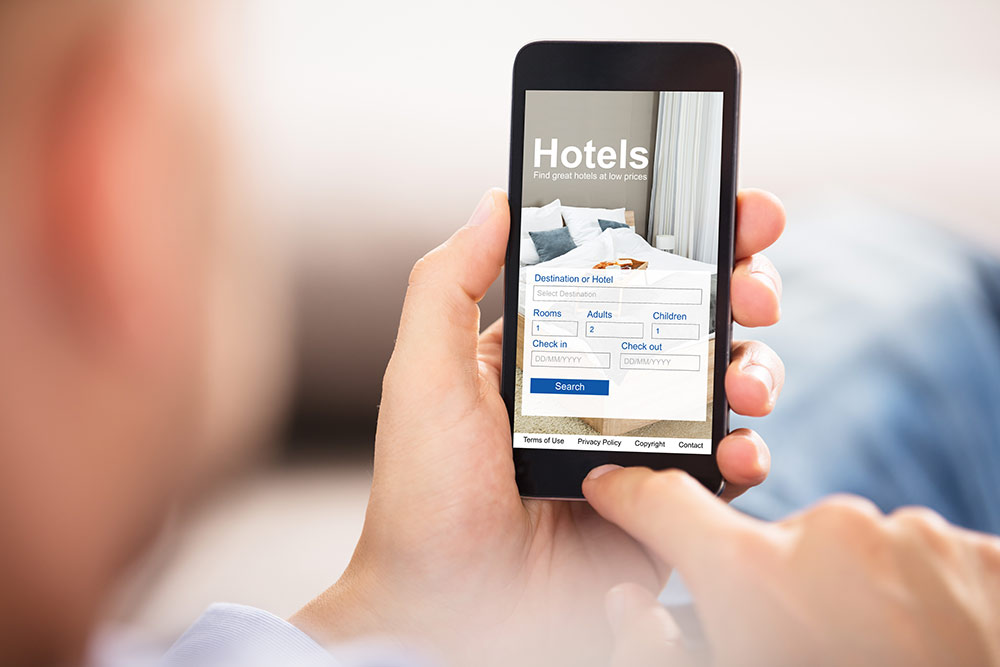
A significant population across the world browses through eCommerce platforms on their mobile phones. Thus, a vital requirement of a good landing page is that it must be mobile optimized.
The bounce rate of a site whose landing page is not mobile optimized is bound to suffer. Mobile optimized sites need to be compelling enough to entice visitors to take action.
As per recent research, even after using a responsive theme, the landing page elements were designed for its desktop version. Flashy graphics and designer fonts occupy excessive space in mobiles, which may slow down the loading time. To avoid motion at a snail’s pace, use streamlined navigation for your mobile-optimized site. Otherwise, a slow load time will decrease your conversion rates. Also, pop-ups, forms, etc., may be used to attract the attention of the visitors.
Tip #5: Use An Attractive Headline
The headline of a page has to grab the attention of the visitors immediately. It needs to be concise but compelling. A maximum of ten words should be enough for a headline.
A short, to-the-point, and catchy headline will help the visitors get to the point immediately. The purpose of these headlines is to tell exactly what services the brand intends to provide.
Tip #6: Use Persuasive Subheadings
If a heading draws people to a landing page, a subheading should be what makes them stay. An appropriate subheading is strategically placed below the heading. It needs to be a bit more detailed and persuasive than the heading. If the visitors find that subheading does not enforce what the heading talks about, they will not hesitate to bounce back.
Tip #7: Use Images Wisely
Visual content is an essential requirement for designing impressive landing pages. Psychology states that the human brain processes images much faster than text. A landing page without pictures will not leave much impact on the human mind.
However, make sure not to use too many images. A blend of content and relevant pictures should do the trick.
Check for the following characteristics before displaying the pictures on your landing page:
- The images should be optimized
- The primary purpose of an image should be to grab the attention
- The image needs to be relevant to the website or product
- Premium quality images should be used
Tip #8: Be Honest
The search engines crawl through landing pages regularly to understand the services the brand offers. They promote only those websites that are genuine and reliable. Make sure not to make any false claims.
Do not promote camping products and land the visitors on a page about cycling. Both the visitors and the search engines will disavow the website leading to a fall in its rankings.
Final Words
The main aim of any landing page is to convert visitors. Displaying too much of anything will increase your bounce rate and decrease your conversions. So, make sure that the landing page contains a blend of everything essential. Follow the tips mentioned above to make sure that your landing page is worth the visitor’s click.